CHRISTINE QUARTE PHOTOGRAPHY
2023
I was approached by a photographer about crafting a brand for her photography business. She is primarily a wedding photographer based in Atlanta, Georgia, and she had a very clear idea of what she wanted her branding to entail. Christine knew that she wanted her brand to evoke certain feelings; the core values are focused on connections, honesty, joy and narrative. She wants her brand to feel fun, inspiring and welcoming.
Her vision is to make people feel comfortable as themselves, so she can tell their true story in a reflective and timeless way. She wants to be perceived as professional, elegant and bold - yet with a touch of character and creativity. She loves the “modern meets vintage vibe” - but wanted something that still reads as professional. Graphic elements that she was interested in were sparkles to add a flair of magic and whimsy, without going too far into moons, crystals, and such.
LOGO ITERATIONS
round 1 - typography exploration
round 2 - graphic exploration
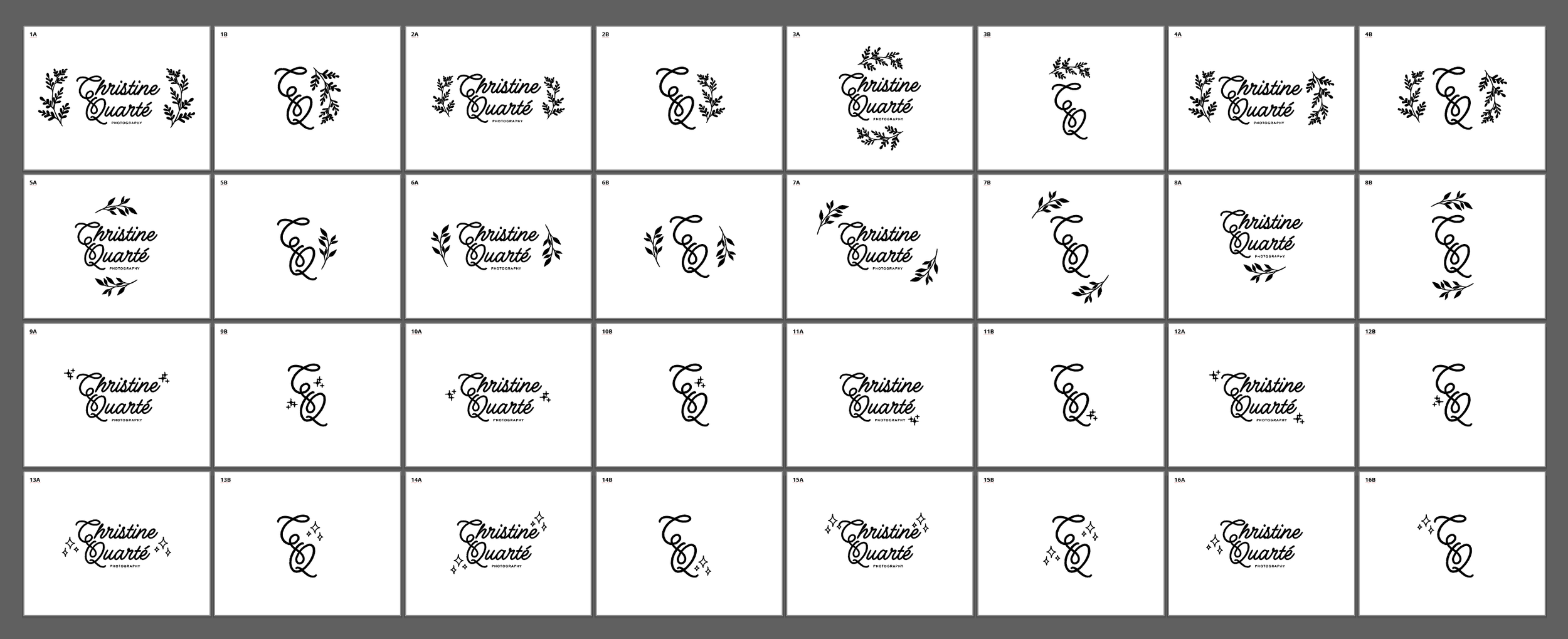
round 3 - specific graphic exploration
round 4 - color exploration
Christine gave me a number of color schemes that she was interested in pursuing, each with a specific vibe associated with it.


