
NATIONAL COVERAGE CORP.
2023
I was approached by an associate about bringing to life a new logo that their company was hoping for. National Coverage Corp. is an independent insurance company with a focus on national construction casualty and property solutions. Its headquarters are in Long Island, New York, yet NCC’s primary clients include many of the largest retail brokers in the US.
The original logo was in a similar color palette, focusing on a lighter sky blue, and a deeper navy blue. This was something that they wanted to keep in the new brand identity, while removing some of the shading that may have been bringing down the cleanliness and simplicity.
Along with giving me pointers as to which directions the group wanted to take this logo, my colleague sent me an initial sketch that gave me a general idea of what the ideal final product could look like (included below).


Initial Concepts
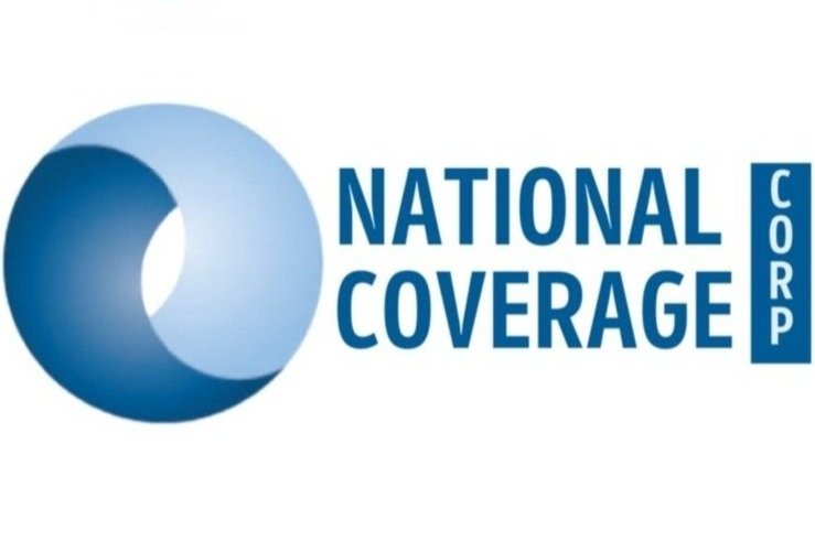
Final Logo
After exploring the initial concept with the lowercase “ncc” in the background, we decided to explore using uppercase lettering instead. It was concluded that this was the way to go for readability and aesthetics.
The uppercase logo went through a variety of typeface explorations, which finally ended by landing on Proxima Nova for the “NCC”, and DIN Condensed for the wording.
The final logo exudes a similar energy as the first logo in the cool color scheme and bold uppercase logo, but elevates to a cleaner level with the flat graphics and a streamlined shape.