

GORILLAZ BOX SET
2021 - 2022
This project is in no way affiliated with Gorillaz.
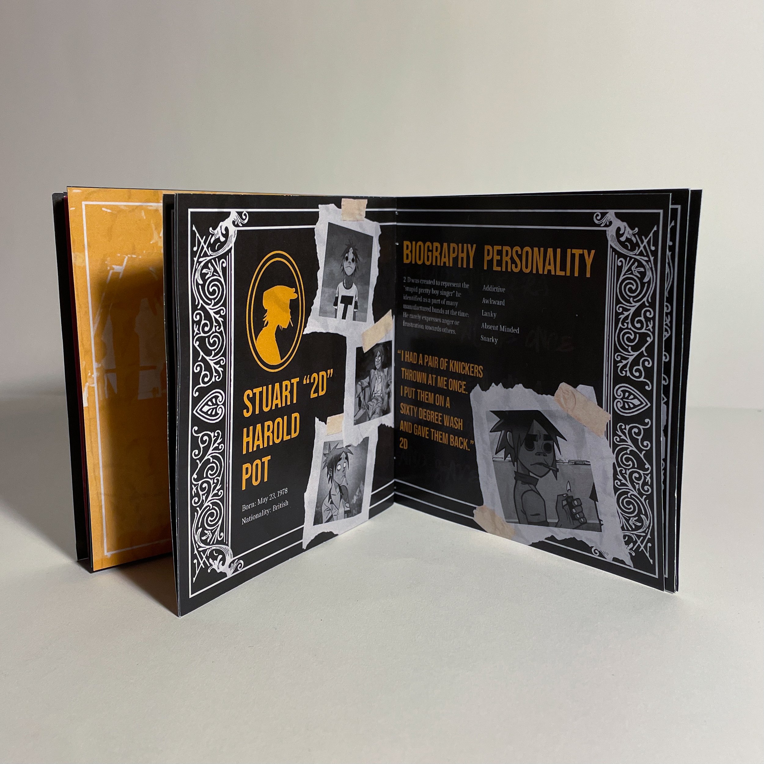
The Gorillaz Box Set was created during an assignment calling for a collection of music packaged in a meaningful way that pertains to one of our favorite artists. I chose to pursue creating a collecting of music dedicated to the band Gorillaz. This specific group consists of one singer, who often employs the help of a visual artist. This artist brings the band’s music to life in the form of four characters; 2D, Noodle, Russ, & Murdoc. I wanted to honor each member of the virtual band with a collection of music.
The virtual band members are depicted on the front of their collections in a way that mimics thee style of playing cards. Each of them have the upright facing version of their face listening to music and in a more positive light, and each of the opposing facing versions have a darkness to them. This is to represent the many different sides of these characters, and the extensive varied lure that accompanies each of them.
first draft
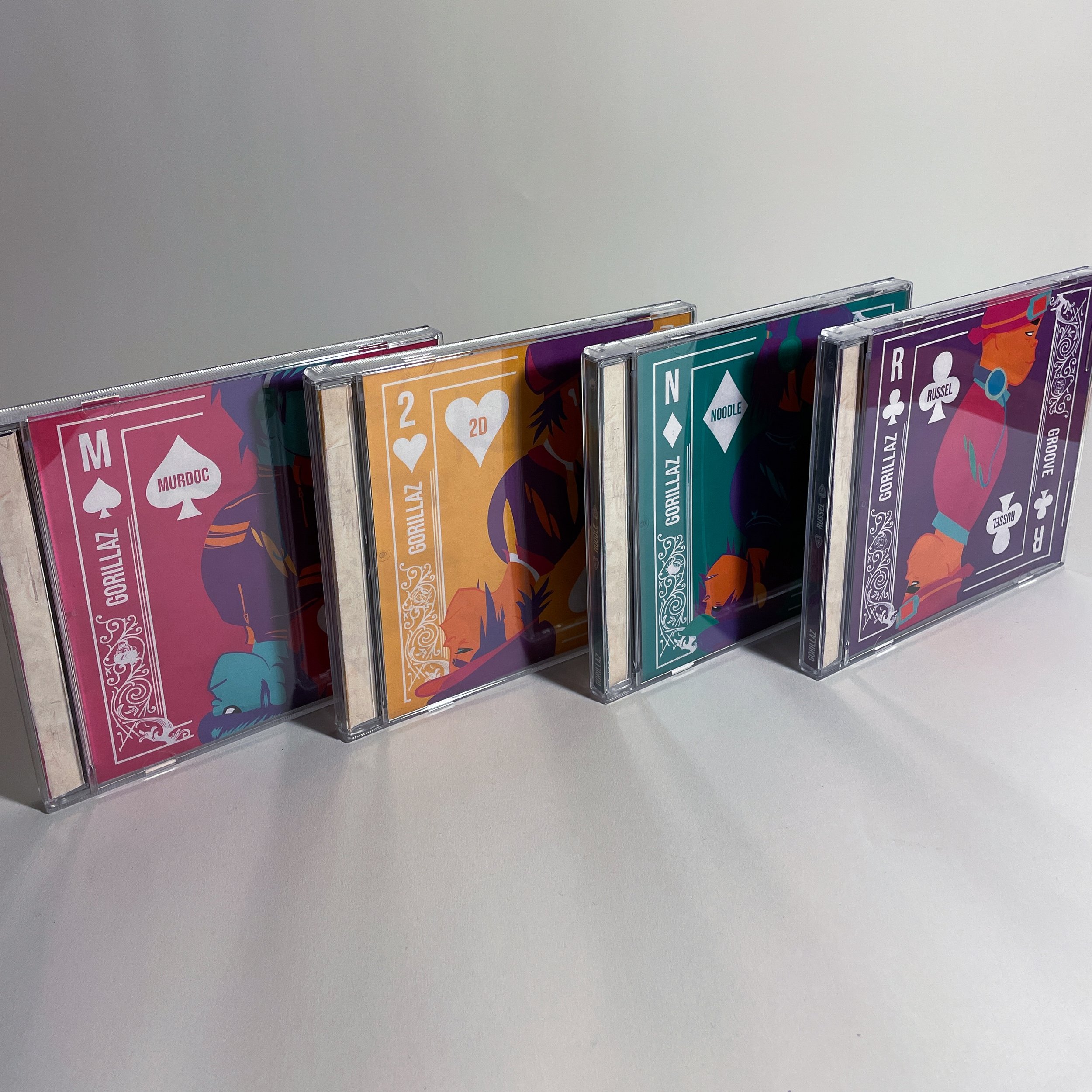
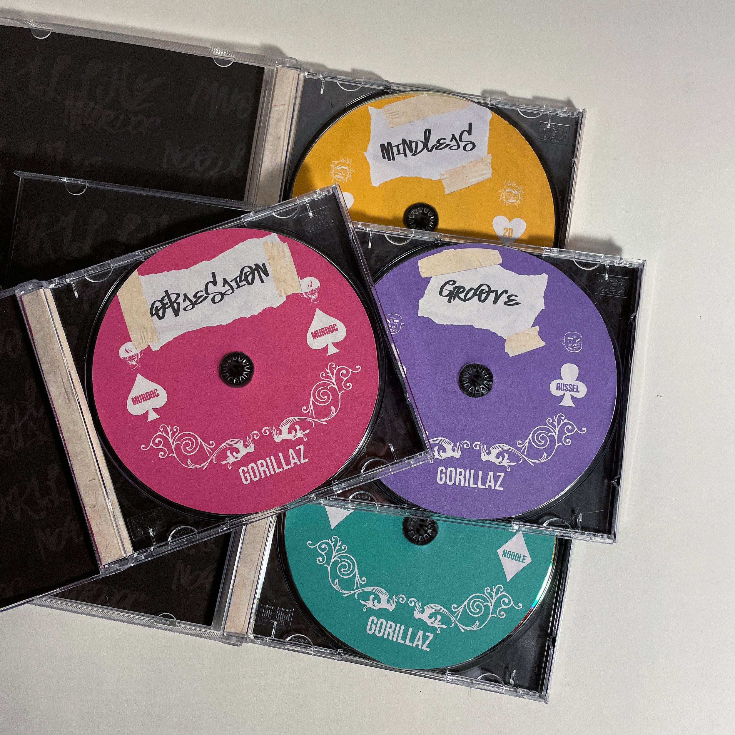
Originally, I had the idea to make CDs for each collection, as well as a corresponding box to hold all of them. I was very tied to the idea of creating around CDs, as this was the medium in which I was first introduced to Gorillaz. I wanted to have a strong color story throughout, and knew that I wanted the design of each collection speak for themselves, and have the box theme be more subdued; more of complement to the materials within than a statement itself.
But when considering the visual thesis I was aiming to follow, creating CDs proved to not be the best option in this project. I am very thankful that I began by creating this by hand, because it made me really think through all of the aspects of what needed to be designed for this project, and the little things that go into designing packaging. This object is also something that I will cherish forever, and that will remind me of everything I learned about design along the way.
second draft
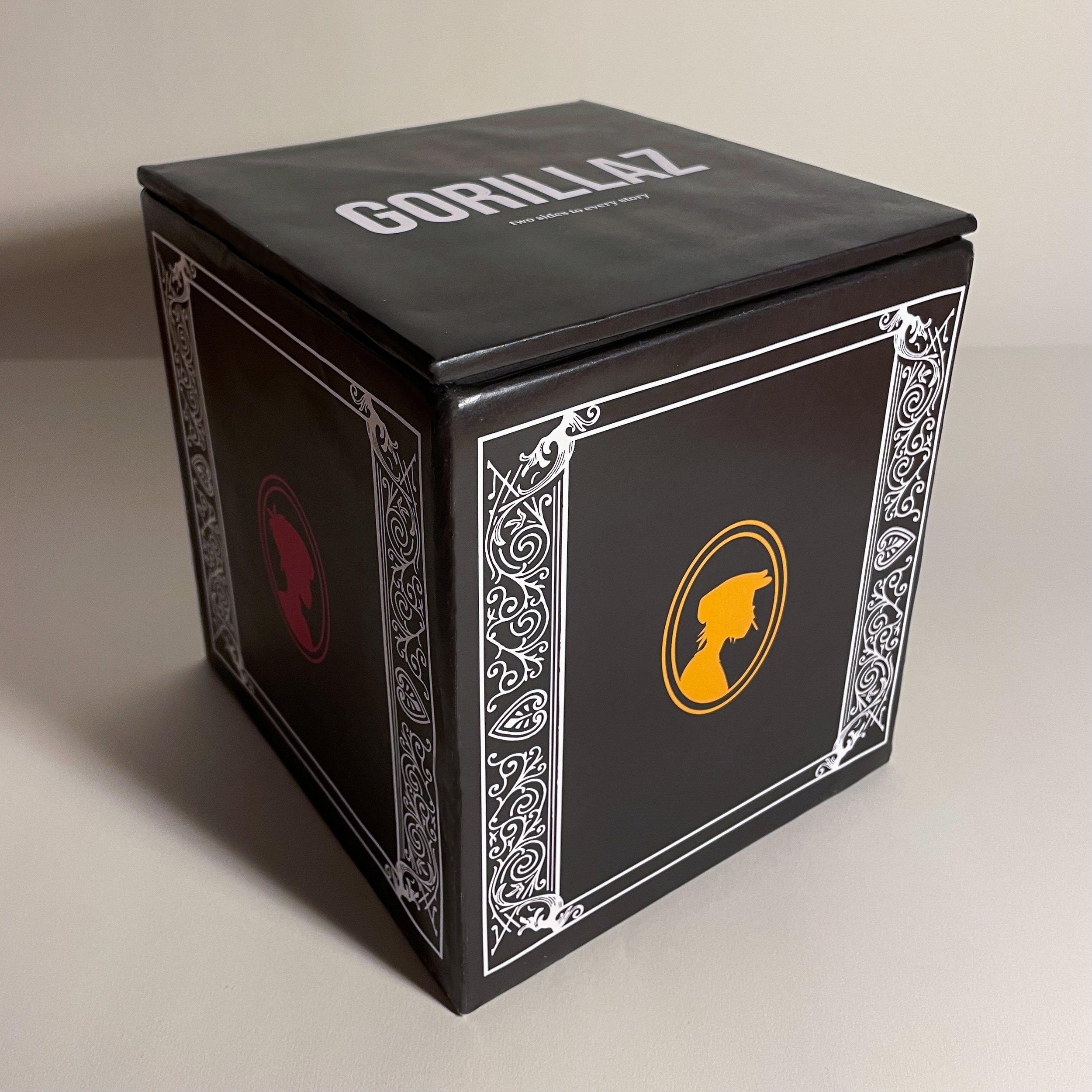
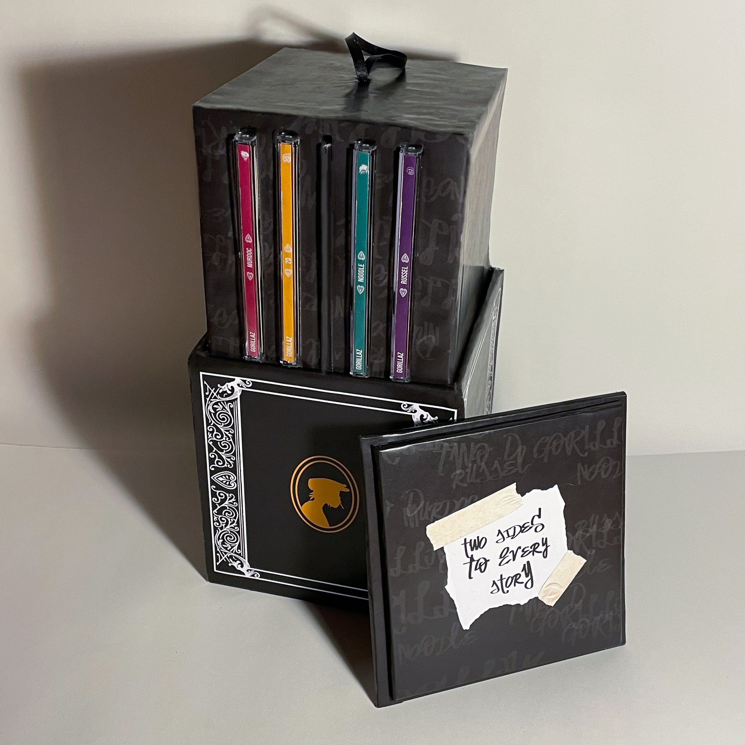
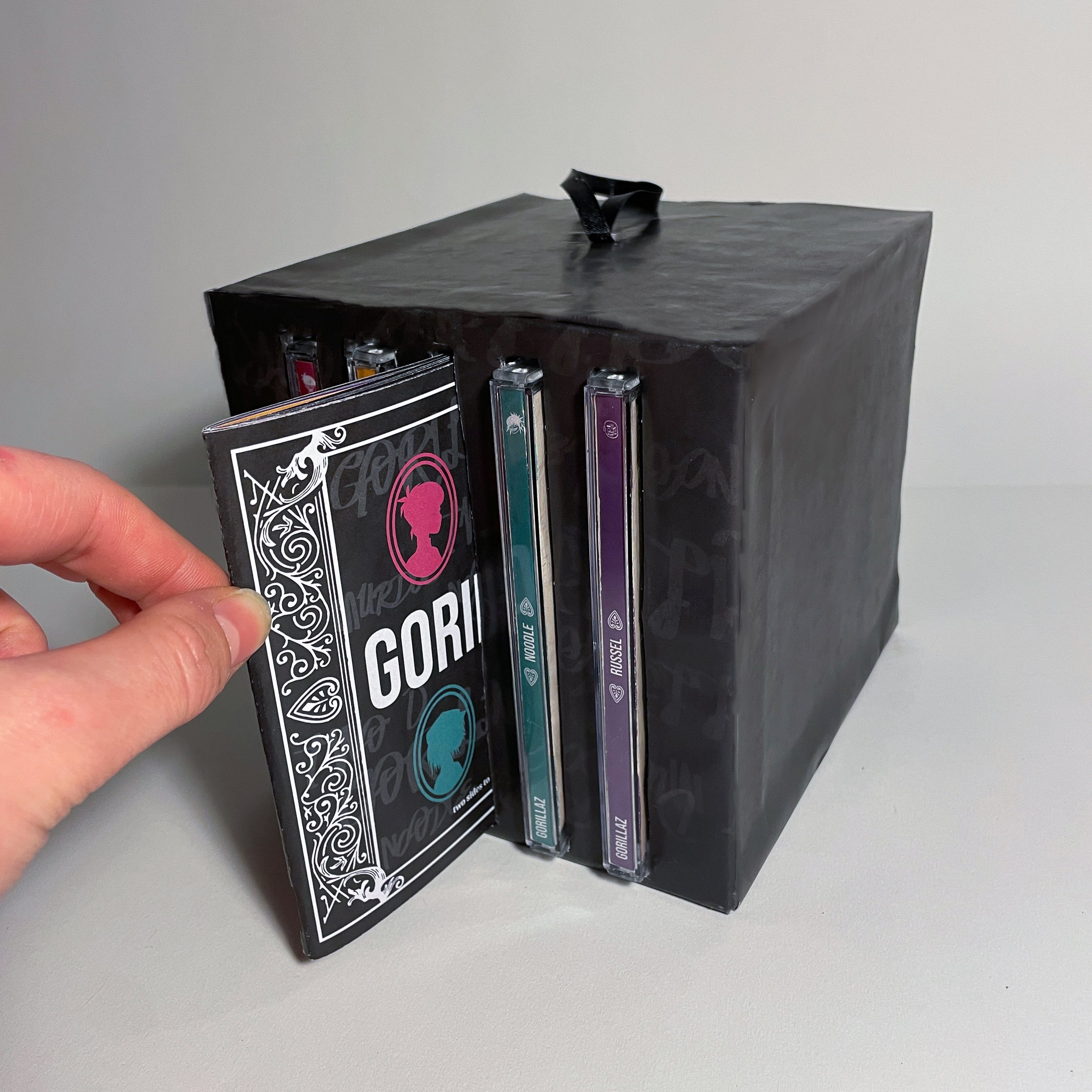
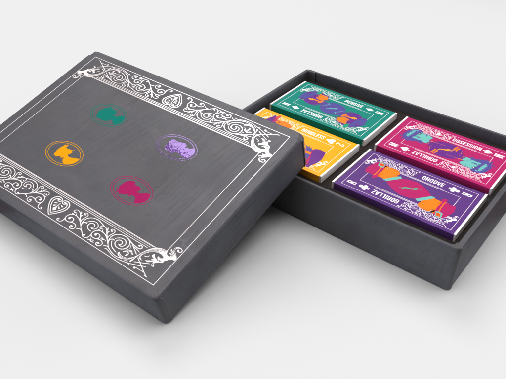
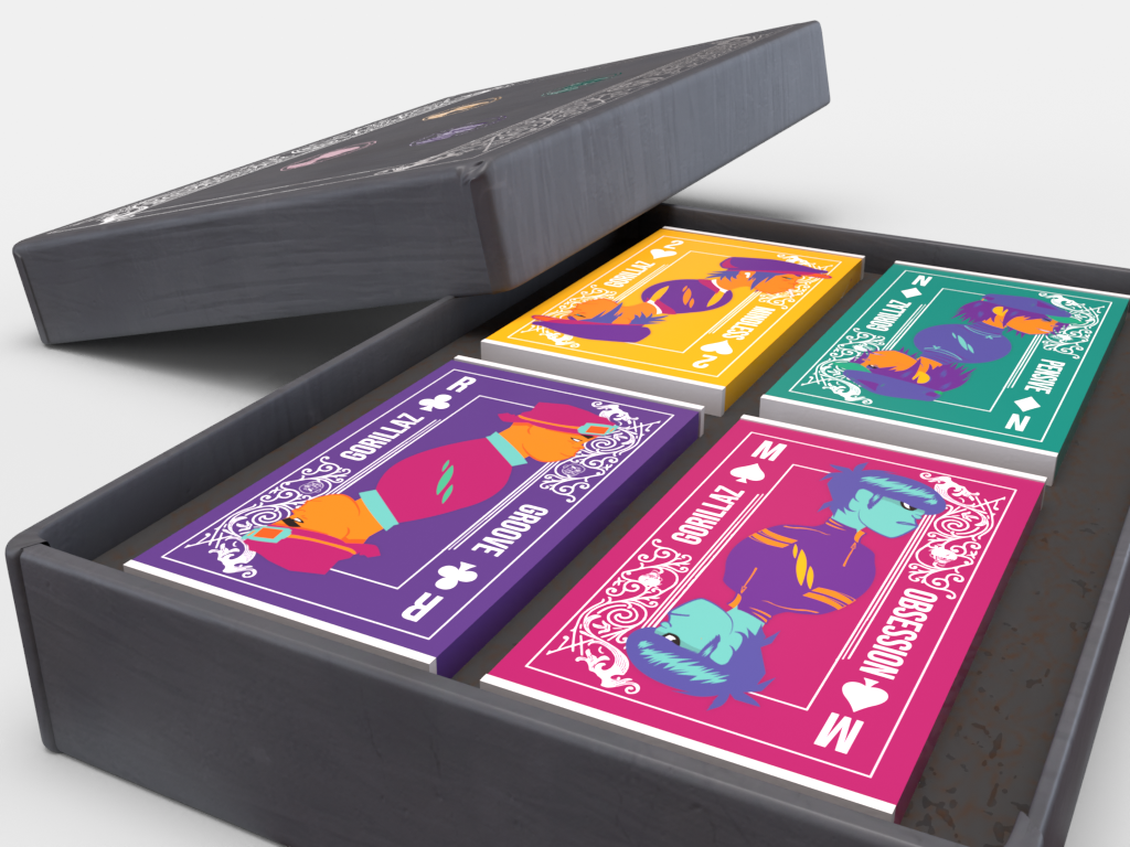
Design-wise for the revisitation of this set, I went for a motif loosely inspired by playing cards, and the two faces that each card possesses. This reminded me of the somewhat two faced personalities of the virtual band members. Switching from CD’s to cassette tapes made it much easier to understand the theme of the playing card, as they share a similar shape. Each character has a color that I assigned to them to represent their branding material. These can be seen in multiple places throughout the project, and always remain consistent for identity.
The box itself is much simpler than the first version. This allows for the novelty to surround the actual tapes rather than the construction and unveiling of the box. The silhouettes of the band members can be seen on the cover, as well as the detailing edge taken from a real playing card. Unlike the CD box where the covers of each musical collection were concealed until pulled out of the packaging, this package allows for them to be fully seen as soon as it is opened.
3d modeling
After an extensive search of the internet for any sort of tape packaging whatsoever, I came up with nothing. I decided it would be better to just create what I was looking for myself, in order to get it exactly the way that I was imagining. Using Adobe Dimension, which is the part of the Adobe Suite for basic 3d modeling, I constructed a package that I thought was suitable, as well as the tapes inside. It was great to be able to play around with textures and lighting in the program to make something suitable for this project.


conclusion
This collection honors the four members of this made up band, and allows people to see into the personalities they hold through the tracks on each tape. This box set focuses much more on the featured designs than the way things are constructed, and allows listeners to display the collection much easier.